Showing posts with label VisCom1. Show all posts

Friday, December 10, 2010

Taxonomy

     Here are a few of the pages from our completed taxonomy booklet-


Past Project...

     In this poster iteration, I clearly need to take a step back and think about what I was doing.  It was at the end of the project and I was feeling pressed for time and I let that dictate some of my design decisions where it shouldn't have.  While I think this iteration has some potential it really had no place in this project.  Where I should have been choosing a line study that is cohesive with the lines and angles of the building.  Instead I decided it was a good idea to take the least noticeable lines to work off of.  The two really just don't go together enough outside of that one instance, and while the perspective is a nice idea, it only succeeds in making a clutter and doesn't tie in the rest of the image appropriately.
In my opinion the only thing that is really somewhat successful is the placement and alignment of "downtown" with the "n" aligned with the side of the building.  It is still a little close to the edge of the composition though.

Wednesday, December 8, 2010

Semester Reflection

     I would say that on a formal basis, things like using grids and exploring space both more openly and selectively is something that crossed over between assignments for sure.  On a more conceptual note, I've learned the importance of keeping my concept clear and in view at all times during a project.  Even if I am happy with my work formally it doesn't really make much difference if it looks good and doesn't say what I want it to.  Also being able to let my design be affected more by outside influence and natural objects and occurrences, and integrating those things with my design to broaden my visual style.  Last but not least, I have learned to not be afraid of working in analog from time to time (even if working digital is my favorite), and that Flash, while faster, is nowhere near as intuitive as After Effects.


     All of these things both formally and conceptually will definitely be useful to me in the future.  Now let me just hit "⌘s".

Tuesday, December 7, 2010

Thursday, December 2, 2010

Venezky

    Martin Venezky's specialty seems to be large,open, uninhibited collage and collection.  It is in his book "It's Beautiful Then Gone" that he tackles the mind boggling process of organizing his collage and collections.  The Format of which keeps with his style of his pieces only broken up with the thread of information running through and often mixing with his images much like a collage.  I suppose this would make him successful in bridging his work and documentation in a manner that takes direct lessons from the form of his work. 

Friday, November 19, 2010

HAIKU Final Images.

These are the final images with the lines of the haiku they represent included in the composition.


Tuesday, November 16, 2010

Taxonomy Format, Organization, and Classification.

The book will be organized as such

1. Cover


2. Table of contents


3. Manmade/Natural

  • Object used in mark making
    • Method/Manipulation

Marks made from similar objects and methods will be placed on the same pages.

The book will be bound with either saddle stitch or wire-o.  (tentative)

The format will be square.  (tentative)


http://erikagoering.com/2010/11/16/taxonomy-and-such/

Thursday, November 4, 2010

Leo Lionni.

Leo Lionni is a man who is making a plea for visual consciousness at all times, and to have meaning for the choices we make both formally and conceptually.  At the same time it may be the greatest form of inspiration and preliminary process to just let the sketches be sketches and not let the hand be as affected by the concept.  This can allow for more pure image making and a broader palette from which we can draw and redistribute according to concept later.  I'm still debating with myself just how much you can allow for pure unadulterated image making to go before it can be counterproductive to final deliverable requirements.  Pure image making however can be very relaxing (then it comes back to bite you in the rear because it is too distant from a workable concept).

Thursday, October 28, 2010

     My overall concept for these posters was to show the vacant nature of some of downtown by highlighting both the upper and lower parts of the area.  For both the skyline and the ground level I took the original image and broke it up, setting it against the area that is not represented to accentuate that vacancy.  In the first I juxtapose the progressive line study and the progressive nature of the building as it curves back into space.  I then progressively bring the lines down. The negative space leads from the upper section of the city to segue into the second poster.  The second poster is focused on the lower part of the city leaving the higher parts open.  I used the progressive manipulated line study to accentuate the movement of the stairs and also hold the upper area of the composition.
     My process included allot of reworking between the concept and formal exploration and decisions.  Using the different methods of line manipulation did allow for a greater palette from which to draw information from.  The use of analogue manipulation/sketches for the first drafts of these posters was helpful for direction but I found that moving into digital after that allowed for faster editing that for the most part allowed me to keep moving.

Wednesday, October 27, 2010

Paula Scher

     Paula Scher is, from what I've gathered, a very expressive designer who is influenced heavily by her surroundings and her disdain for helvetica and every conforming, conservative, war starting institution for which it stands... sigh.  While I do enjoy her designs aesthetically and formally I find I often disagree with her reasons for her formal choices.  Doing a project a certain way for a thousand dollars is fine, but I don't think you should then be able to trace every decision back to "and it allowed me to keep the thousand dollars".  A thousand dollars does not mean you can make Utah an Island to justify your geographical misnomer.  But I digress (busts a vein).


     One thing that Scher does have right is her observations about how geography can influence design.  The world is full of lines which in turn make one giant grid for us designers to fit into.  Letting this grid influence our design allows for cohesion between the environment and design.  Obviously we probably won't be making a building in New York that follows the grid of our design.  More commonly the infrastructure will already be there as there are certain rules to follow, and nobody wants a design that doesn't look like it belongs somewhere.  This also forces us to create solutions for spacial relations we do not naturally process, and take lessons from these solutions.  The infrastructure that we have made is an extension of us, and our design is an extension of the infrastructure.

Friday, October 22, 2010

BitMap vs. Vector

A comparison of bitmap and Vector... GO!

Bitmap-
Bitmaps are great for your basic raw or edited photo.  They're as close as replication is going to get to the real life imagery.  They also have an atmospherical grain that can make foe a nice contrast between the hard edge and graphic style of vectors and other design elements.  Bitmaps are directly proportioned to their original file size and pixel dimension so if you distort or make a scale change you have to make sure that you do not stretch the dimensions beyond their limits.  If you do it will cause for large out of focus/grainy images.

Vectors-
Vectors are not based on the width of a pixel, but on shape alone.  Because of this you can stretch a vector image out as large as you want.  The danger here is for there to be some issues with proportions after an image is stretched so far.  Vectors do have a clean line that defines their edges, and can work together with themselves or be used to spice up a bitmap image.  They can translate well within many different formats which makes for quick editing.

Wednesday, October 20, 2010

Lines Critique.

Downtown: The line study itself demonstrates regularity which keeps with the buildings repetitious pattern of windows.  I took some of the bricks to make a more gradual transition between the photo and the study, which was previously to sharp.  The text is aligned with the line study/window extension, but it might not be adding any thing to it compositionally and it may have so kerning issues.  The sharp clean lines of the typeface I believe express some of the fast, sleek, and tall nature of the downtown area.  The building itself represents some of the business/living aspects of downtown.  In each of these I tried to use symmetry, asymmetry, and alignment between the line studies, the photograph, and the negative space.  The study and the photo should both represent aspects of downtown while the negative space should emphasis some aspect that is not present.

In this composition I'm trying to again use alignment, symmetry, and repetition.  The type is more integrated into the structure of the building, and plays against the thin vertical lines of the windows.  At the same time the line weight may need to be thicker because of the large blocks between the building segments.  The transition between the building and the study in this composition is much more abrupt than the previous one.  I cut the sections of the windows away from the side of the building and brought the line study up through those spaces to make more of a vertical flow between them.

For this composition I went further with editing out the front facing windows and placing them between two line study segments.  Taking out the windows except for the ones that are open gives it a sense of vacancy.  The text may need to have more presence and be aligned better to the established grid.  The composition  shows continuation and alignment.

With these compositione I tried again to draw attention, through alignment and continuation, to the negative space at the bottom.  The text may need to go toward the bottom for clarity.


I also tried to blend the lines between the building and the line study by bringing in parts of the building into the study and vice-versa.  Text alignment may be an issue.
This was meant to mimic my first iteration, and also give more emphasis on the line study through form and repetition.

The line studies for the midtown compositions are supposed to keep in line with the easier flow of the neighborhood in comparison to the downtown area.  I experimented with staying truer to the original line studies but it seems to busy.  Also placing the text in the bottom area does not feel right.  I ended up trying to take out allot of the original path and continuing the line study up till the upper slice of the image.  I need more of that part to make that work well though.  The text mimics the lines of that part of the photo.


In both of these the bottom half is far to busy and the text does not feel attached enough to the rest of the composition.

Tuesday, October 12, 2010

Juxt... J... Juxtap p p... Juxtaposition.

     Juxtaposition... a word that I've heard thrown around so many times since entering art college.  To put two images that have opposing content or contextual meaning, together creating a desired or undesired new meaning or relation.  In many cases there can be some serendipitous juxtapositions that aren't necessarily intended.  While these results can be powerful and unexpected it is probably important to keep an eye out for juxtaposition in design to avoid creating something too contextually off kilter.  On the other hand considering observations in juxtaposition when designing can successfully alter meaning, and allow for previously unattainable compositions that appeal to the viewer's sensibilities on a deeper level.  Cropping also plays a big part in keeping whatever cohesion is necessary in the composition, and to add drama and tension.

Thursday, October 7, 2010

Type in Lines.

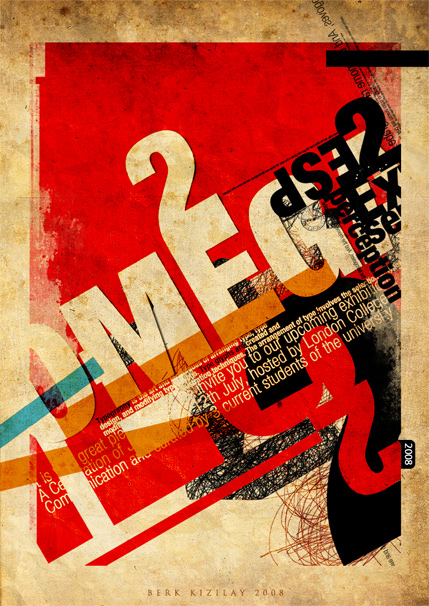
     Here is an example of lines being employed in an advertisement for an exhibition.  The designer is Berk Kizilay, and on a side note according to his Deviant profile he has a mustache...
     The image features a mass of type that is structured on a grid giving it a sense of order, but it is a random order.  It is just a little grungy for my taste but beautiful none the less.

Typography Posters

http://webdesignledger.com/inspiration/33-amazing-typography-posters-and-illustrations

Tuesday, October 5, 2010

Lines Lines Lines...

     All of the elements we have dealt with have been linear elements.  However it is very easy to see these new compositions as having black lines on a white background (for me at least).  By definition (as a path) however I have to look at the bigger picture.  Everything in these compositions are lines, from the black or white lines to where they touch and the spaces in between.
     These linear elements work together to create shapes, curves, and even the illusion of dimension and perspective.  Closed or heavy weighted lines make a plane, and planes joined together with added perspective (with or without a vanishing point) can give you three-dimensional elements.  We have been using pre-existing dimension and perspective to form our lines.
     The linear elements together can work to create a grid for placing and organizing other graphic elements such as image and text in order to give them added perspective similar to the lines themselves.  Once these elements are aligned to this skeleton they become/create linear elements themselves.  I'm guessing that this aspect of lines will play heavily in the next part of the assignment.

Wednesday, September 22, 2010

Layers and Transparency.

     As much as I love to work digitally, it is very interesting to take a step back to see that the way we are composing our books is not so far off base from earlier analog design methods.  Creating, finding, cutting, pasting, and overlapping are all useful and ageless, viable techniques that have been the forces of creative design process far before the introduction of digital methods.  The layering process can give you information about physical, spacial, and abstract relations.  Transparency often goes hand in hand with layering and can often accomplish the same things, but it can also affect the clarity of an image.  It can cause the imagery to be more direct or less obvious.


     I feel that the interplay of image and type in my book could help to strengthen the communication of the topic and individual words.  In the end there will be a tag team combination between the dot compositions who's actions elude to and support the typed word, and there will also be a similar relationship thanks to the typographical metaphors which do their part to convey the meaning and the topic.  In the way of aesthetics, the flow of communications should benefit, and the pages them selves will probably look much sharper where necessary and more complex where some tasteful confusion will aid my theme.
It is hard to think about the serendipity at this point, because I keep thinking a little to far ahead, and it actually gets a little stressful.  However, I can see where certain compositions will have potential to blend together and look very nice... exiting!

Friday, September 17, 2010

Book Testing.

     So today I've been preparing for the final push and getting all of the Vis Com aspects of my book ready and into production mode.  I'm pretty sure I'm ready to dive in once I've finished fixing what I need in typography.  I have to say though I would have been much further along this afternoon if the printing part of prepping my pages didn't go so rough.  It took forever and I even had to at one point go to campus tech to get.  Kudos to all the juniors and seniors who helped me out (or tried, basically I'm beyond hope when it comes to printing).  What I did get done was a demo for my covers, all of the first layers of my pages printed and copied to taste, and those copies spray mounted onto bristol board.  I can almost see the light at the end of the tunnel now.


Tuesday, September 14, 2010

Field of Tension.

     The reading from type and image was a little hard for me to follow for some reason.  I don't know if it's the particular language used to describe the function of elements that create tension in a design was a little fast for me, or if I'm just tired and distracted.  I think it's both.
either way from what I gathered Meggs is trying to describe the way in which elements in a design can push and pull the viewers eyes through the composition.  Using weight you can pull the eye in the direction of a heavier object or to the space around a smaller one.  Lines of image and text can direct you across a page or carry you out of the frame, and the angle, size, style, and placement of the text can reflect on their meaning and respond to the surrounding imagery.  Certain colors that attract attention in a composition can also read as a roadmap for the viewer to follow.  While being conscious of these decisions can give you a well laid composition, I feel that it is easy to get carried away with unnecessary information.

Sunday, September 12, 2010

Quantity vs. Quantity.

     Having reflected on my design process after reading Quantity vs. Quality I realize that my work could probably stand to benefit from a greater amount of preparatory sketching.  Not only will this help me to hone in on a better final product, but it will also allow me to further reflect on past process for future reference.  As it stands I often internalize my processes.  This probably causes me to accept solutions before they come to fruition.  It seems as though it is often demanded of myself and others to sketch more as well as simultaneously rush to see the final solution.

Thursday, September 9, 2010

A Failing Mind.

     The title I decided to go with for my book is "A Failing Mind".  The theme is based on the degenerative effects of mental illnesses.  The final nine words words I chose are:

  1. Functioning
  2. Regressive
  3. Degenerate
  4. Erode
  5. Disoriented
  6. Irrational
  7. Dissociative
  8. Unfamiliarity
  9. Dysfunctional