

Showing posts with label Type1. Show all posts
Showing posts with label Type1. Show all posts
Thursday, November 4, 2010
Web Spreads Cont.
Here is my latest iteration for the final spread. All that was really changed was an issue with the top white space placement.


Monday, November 1, 2010


Monday, October 25, 2010
Grids...Where They Be?


This exhibition poster, created by a designer that goes by "Network Osaka", shows a good sense of proper grid structure in its design. It is divided in half from top to bottom and horizontally in almost perfect thirds. The first line of text below the title begins at the edge of the first third and extends to the end of the second aligning with the "I" in the title. All text below that is aligned within the first third. The title and the text below it take up an even amount of space. Aside from the broken color gradient residing below the center line there are only a few instances where edges align with previously established grid lines.
http://www.flickr.com/photos/networkosaka/2388859822/in/set-72157605232895544/
http://designreviver.com/inspiration/30-inspiring-poster-designs/
Friday, October 8, 2010
Typeface.
Yesterday when we all traversed over to the theater to see Typeface I was expecting to see a movie that was not only about the process of the wood type but typographical principles as well. It was however heavily weighted on the wood type and the museum/shop that still makes use of it. It chronicled the history from past to present of this printshop up in Wisconsin. It showed the workers who for the most part are retired, dead, or on deaths door. The biggest most time consuming part of the printing process is not just setting all of the type in place but putting all of it away in their respective cases afterwards. This was an even more daunting task for those pieces that were just laying around in the museum or in the collection of the small group of designers who set up a small printing studio a few hours from there. Depending on the amount of use or neglect the typeface could succumb to damage which doesn't necessarily ruin it. Any damage adds character to the typeface, which actually makes it its own unique set. Methods using polymer instead of wood can never quite have the same feel of the wood type, and is considered by many to be of a cheaper quality.
The movie overall was really depressing. It focussed to much on the museum than over typography or wood type in general. It seems as though from the tone of the film that the museum will eventually close, and the art of wood type will probably follow its lead. The only way I could see it surviving is through those who would print for the novelty of it. The practice itself is highly impractical in today's economy and fast paced environment. Even the man who was previously in charge of the museum had to sit down and really think about his future. I suppose the movie was more of a warning about the future of wood type.
The movie overall was really depressing. It focussed to much on the museum than over typography or wood type in general. It seems as though from the tone of the film that the museum will eventually close, and the art of wood type will probably follow its lead. The only way I could see it surviving is through those who would print for the novelty of it. The practice itself is highly impractical in today's economy and fast paced environment. Even the man who was previously in charge of the museum had to sit down and really think about his future. I suppose the movie was more of a warning about the future of wood type.
Thursday, October 7, 2010
Mike and Types. (Cont.)
Here are my bitmap words made from Mike and Ikes. Kerning is as accurate as my eyes can tell. Some of the guidelines I followed are a x-height of five "ikes" and major ascending serifs have one "ike" placed at a diagonal. Ascending stems also must be two "ikes" wide, while horizontal must be one.


Monday, October 4, 2010
Thursday, September 30, 2010
Mike and Types.
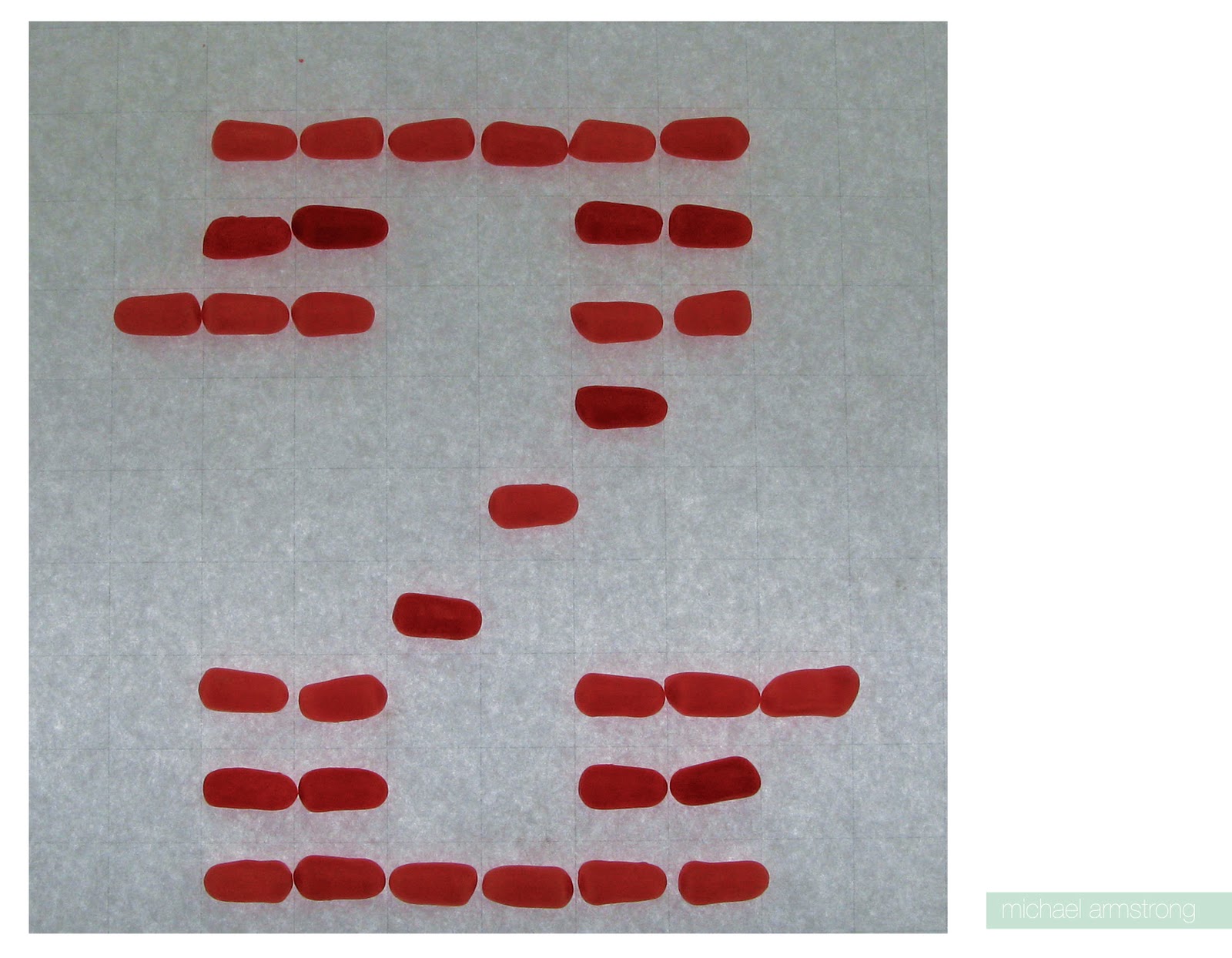
Ok, so really quick because it's late and I'm sick now apparently (oh yippee) here are the three sets of hand made typefaces. I tried my best to follow my own set rule when designing them, such as what serifs looked like and where line weight was a certain size and angle. Shooting on the light table was a mistake though because the lighting actually made the paper hard to edit out, and you can still see the grid a little bit.




Monday, September 27, 2010
Helvetica (Oh Yeah).
So Helvetica... best font ever. I know that this is just my subjective opinion (even if its right) but it is really such a versatile typeface. Helvetica took me out of a dark place full of grunge fonts and stencil fonts and grunge stencil fonts.
Watching the documentary Helvetica really just reinforces why I enjoy it so much. I love the way it takes you through the modern visual landscape of todays cities and how it permeates so many aspects of our culture. The fact that they point out is for however widespread its use is because we see it everyday it becomes installed in our brains as this normal functioning thing. This is what makes it such an automatically accepted universal font.
The other part of the documentary that I enjoyed was seeing the people, who do not like the font or fervently hate it, try and justify there reasons. I suppose most particularly expressive designers feel the same way, but seeing people attribute it to big business, "right wing propaganda", and conformity drives me up the wall. At that point lets face it, it's not Helvetica thats the problem is it?
Wednesday, September 22, 2010
Layers and Transparency.
As much as I love to work digitally, it is very interesting to take a step back to see that the way we are composing our books is not so far off base from earlier analog design methods. Creating, finding, cutting, pasting, and overlapping are all useful and ageless, viable techniques that have been the forces of creative design process far before the introduction of digital methods. The layering process can give you information about physical, spacial, and abstract relations. Transparency often goes hand in hand with layering and can often accomplish the same things, but it can also affect the clarity of an image. It can cause the imagery to be more direct or less obvious.
I feel that the interplay of image and type in my book could help to strengthen the communication of the topic and individual words. In the end there will be a tag team combination between the dot compositions who's actions elude to and support the typed word, and there will also be a similar relationship thanks to the typographical metaphors which do their part to convey the meaning and the topic. In the way of aesthetics, the flow of communications should benefit, and the pages them selves will probably look much sharper where necessary and more complex where some tasteful confusion will aid my theme.
It is hard to think about the serendipity at this point, because I keep thinking a little to far ahead, and it actually gets a little stressful. However, I can see where certain compositions will have potential to blend together and look very nice... exiting!
Sunday, September 19, 2010
Worg...
So I know that it looks like worg due the issues in hierarchy, but it is actually grow. Who would guess that creating a scale change to imply growth would turn sour on me. If there is anything to be learned by this it is to keep a watchful eye on my scale and how easily it can overpower a composition and change meaning. Also I've learned recently that the letter "O" really sucks up all of the attention from everything else when at a larger scale. It's like a magical black hole of visual pull. In the end this composition was more of a learning experience than a success. I am however feeling more comfortable with my latest typographical metaphors.


Friday, September 17, 2010
Book Testing.
So today I've been preparing for the final push and getting all of the Vis Com aspects of my book ready and into production mode. I'm pretty sure I'm ready to dive in once I've finished fixing what I need in typography. I have to say though I would have been much further along this afternoon if the printing part of prepping my pages didn't go so rough. It took forever and I even had to at one point go to campus tech to get. Kudos to all the juniors and seniors who helped me out (or tried, basically I'm beyond hope when it comes to printing). What I did get done was a demo for my covers, all of the first layers of my pages printed and copied to taste, and those copies spray mounted onto bristol board. I can almost see the light at the end of the tunnel now.


Subscribe to:
Posts (Atom)