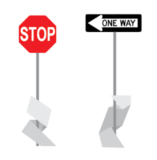
Our conceptual focus is still on the metaphor of following your own path, illustrating the diversity of experiences on campus through the different colors that guide you to each building.
Where last we left off, the guide-shapes were undefined in terms of shape and material. We had the sense that they would be somehow three dimensional and hollow… We've refined this idea, and decided that the guide-shapes should instead be constructed from 1/4 inch cold press steel, painted in bright colors, with a consistent width of 12 inches. These long sheets would be folded, bent, and wrapped around the environment and seemingly burrow into surfaces only to reappear further along the route, joining with other colors or splitting off to lead you to your destination, as established at well-labeled moments of crossroads.
Our style guide retains Futura medium condensed for the KCAI logotype but eliminates the crooked "A" to streamline the text. Our main typeface for navigation and description is now Apex book, with Apex bold emphasis.
Neutral information and space, such as street signs, perimeter, and parking, would contain similar shapes that are painted white so as not to confuse the color-coding of the campus buildings.
The building identifiers themselves would take the appearance of the "end" of the guide-shape, sticking up out of the ground, with a label cut out.
Signage inside a building would be made from the same material and the same color as the guide-shapes outside, folded into smaller individual signs to denote directions, bathrooms, and rooms.


No comments:
Post a Comment