
Tuesday, October 12, 2010
Juxt... J... Juxtap p p... Juxtaposition.
Juxtaposition... a word that I've heard thrown around so many times since entering art college. To put two images that have opposing content or contextual meaning, together creating a desired or undesired new meaning or relation. In many cases there can be some serendipitous juxtapositions that aren't necessarily intended. While these results can be powerful and unexpected it is probably important to keep an eye out for juxtaposition in design to avoid creating something too contextually off kilter. On the other hand considering observations in juxtaposition when designing can successfully alter meaning, and allow for previously unattainable compositions that appeal to the viewer's sensibilities on a deeper level. Cropping also plays a big part in keeping whatever cohesion is necessary in the composition, and to add drama and tension.
Friday, October 8, 2010
Typeface.
Yesterday when we all traversed over to the theater to see Typeface I was expecting to see a movie that was not only about the process of the wood type but typographical principles as well. It was however heavily weighted on the wood type and the museum/shop that still makes use of it. It chronicled the history from past to present of this printshop up in Wisconsin. It showed the workers who for the most part are retired, dead, or on deaths door. The biggest most time consuming part of the printing process is not just setting all of the type in place but putting all of it away in their respective cases afterwards. This was an even more daunting task for those pieces that were just laying around in the museum or in the collection of the small group of designers who set up a small printing studio a few hours from there. Depending on the amount of use or neglect the typeface could succumb to damage which doesn't necessarily ruin it. Any damage adds character to the typeface, which actually makes it its own unique set. Methods using polymer instead of wood can never quite have the same feel of the wood type, and is considered by many to be of a cheaper quality.
The movie overall was really depressing. It focussed to much on the museum than over typography or wood type in general. It seems as though from the tone of the film that the museum will eventually close, and the art of wood type will probably follow its lead. The only way I could see it surviving is through those who would print for the novelty of it. The practice itself is highly impractical in today's economy and fast paced environment. Even the man who was previously in charge of the museum had to sit down and really think about his future. I suppose the movie was more of a warning about the future of wood type.
The movie overall was really depressing. It focussed to much on the museum than over typography or wood type in general. It seems as though from the tone of the film that the museum will eventually close, and the art of wood type will probably follow its lead. The only way I could see it surviving is through those who would print for the novelty of it. The practice itself is highly impractical in today's economy and fast paced environment. Even the man who was previously in charge of the museum had to sit down and really think about his future. I suppose the movie was more of a warning about the future of wood type.
Thursday, October 7, 2010
Type in Lines.
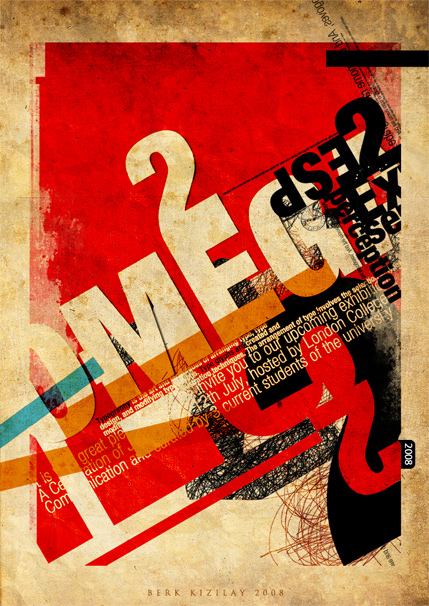
Here is an example of lines being employed in an advertisement for an exhibition. The designer is Berk Kizilay, and on a side note according to his Deviant profile he has a mustache...
The image features a mass of type that is structured on a grid giving it a sense of order, but it is a random order. It is just a little grungy for my taste but beautiful none the less.
The image features a mass of type that is structured on a grid giving it a sense of order, but it is a random order. It is just a little grungy for my taste but beautiful none the less.
http://webdesignledger.com/inspiration/33-amazing-typography-posters-and-illustrations
Do'n A Little Business On The Side...
So the other day I got a last minute commission for some album artwork for a Christmas single. I know that, looking back at it now, there would definitely be some things I would have done differently given more time, and that I shouldn't accept projects that require a twenty-four hour turn around. This time though I thought I'd make an exception. I threw some things together that I had in studio, and even used the photo room for the first time since I've been here. When I went into Photoshop I tried to employ some of the principles I've learned in class with the type. I tried to slightly imply a typographical metaphor with the title. I couldn't be too abstract with it otherwise it wouldn't flow with the pre-existing album artwork. In the end I was up till five in the morning before I considered it "first mock up" close. On wednesday there were a few minor edits I had to do before I sent it off.


Mike and Types. (Cont.)
Here are my bitmap words made from Mike and Ikes. Kerning is as accurate as my eyes can tell. Some of the guidelines I followed are a x-height of five "ikes" and major ascending serifs have one "ike" placed at a diagonal. Ascending stems also must be two "ikes" wide, while horizontal must be one.


Tuesday, October 5, 2010
Lines Lines Lines...
All of the elements we have dealt with have been linear elements. However it is very easy to see these new compositions as having black lines on a white background (for me at least). By definition (as a path) however I have to look at the bigger picture. Everything in these compositions are lines, from the black or white lines to where they touch and the spaces in between.
These linear elements work together to create shapes, curves, and even the illusion of dimension and perspective. Closed or heavy weighted lines make a plane, and planes joined together with added perspective (with or without a vanishing point) can give you three-dimensional elements. We have been using pre-existing dimension and perspective to form our lines.
The linear elements together can work to create a grid for placing and organizing other graphic elements such as image and text in order to give them added perspective similar to the lines themselves. Once these elements are aligned to this skeleton they become/create linear elements themselves. I'm guessing that this aspect of lines will play heavily in the next part of the assignment.
Monday, October 4, 2010
Subscribe to:
Posts (Atom)