DVD Menu
Friday, May 6, 2011
6º Could Change How You Experience a DVD.
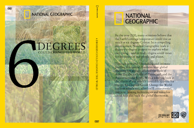
The overarching concept for our group's 6º movie campaign was creating a reorientation of a natural or habitual process, that rewards the user for accepting that reorientation and following it to fruition. Visually we have fleshed this out to a broad compiled image of nature that is stained and covered in oil. In each application there is then a moment in which the user can remove that oil to reveal a clean image underneath.
Monday, May 2, 2011
6º Process
For the group project of rebranding the movie 6º Degrees Could Change the World (six degrees degrees), we have come up with the concept of reorienting the individual's process by providing interaction and a positive result for complying with its particular necessary adaptation. The imagery includes a scene of nature that is covered in oil. In each application there will be a moment in which the user can participate in removing this oil allowing to see what is underneath, while completing the task of interacting with the dvd cover, menu, and poster interface.
Below is the first iteration that gets closest to the stain and/or oil spillage that we were going for.
The rest are the tests up till the final images which is the direction we are moving forward with.
Sunday, May 1, 2011
Ipad Fun–ctionality
Here is the functionality of my Ipad spreads in video format. Its fairly simple in terms of navigation, and hopefully that simplicity translates into clarity. The layout is not unlike that of the previously made paper magazine spreads or it at least nods its head to the aesthetic.
CONFORM•CONSUME
Conform and consume is an exhibit that takes an in-depth look at the assimilation and modification of Japanese culture and cuisine in America. Put more plainly it is how america has taken sushi in all its aspects and traditions and in making it its own, has made it into something completely different.
For this concept I kept in mind the idea of conforming and consuming sushi and how to best portray that.
I decided on taking this on in two parts. The first is to change my icon color to something more appropriately or stereotypically American, thus deciding on the faded glory color scheme. This set the tone for the rest of the imagery. I took the American flag and masked out an area of it to either frame or contrast the icon. The imagery inside the masks were at first shapes of things that reach, grab, eat, and consume, such as the profile of the eating man. Later the imagery evolved into consumption related images that had more to do with the contrast between that image and the more traditional object that the icon depicts. Such relationships are the fork and the chopsticks, and the fast food cup and the tea pot.
Subscribe to:
Posts (Atom)


