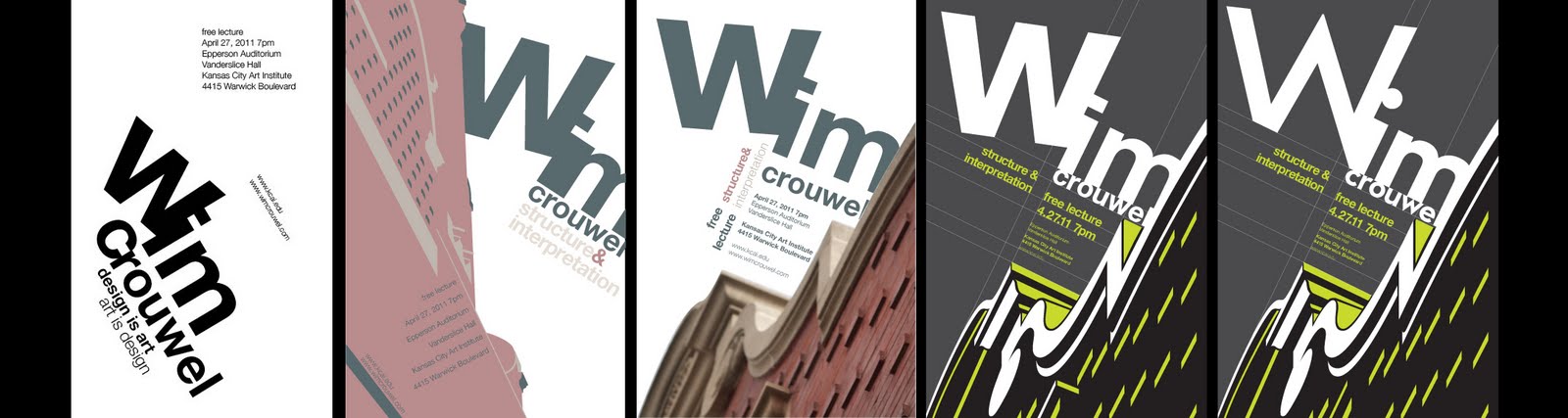
Just wanted/needed to put up some kind of final encompassing evolutionary process of my poster for the Wim Crouwel lecture. This shows the early stage of the typographic exploration, and then applying that to the Vanderslice building in some way. The real goal was to create something that did not necessarily copy Crouwel's work but utilize the same techniques to create a poster that was appropriate for him. I used Helvetica as a means to play off the building's edges with its ultra neutral and unifying characteristics. The color at first was awfully drab and more appropriate to the building than Crouwel's style. The next stage is when I decided to visibly show the grid work that coincided with the buildings edges and use that grid to hang my type. The colors I changed to a green, black, and grey combo for an added pop. The latest iteration that I've done, in order to make the title more fitting to the style of the building, uses a more expressive typeface that contains some of the same elements that I've tried to call out in the building.
I've also cleaned up some of the more arbitrary grid lines and fixed the accidental tracking issues.
One thing that I've learned, other than an the fact that its now difficult to not think of alignment in my compositions, is that even with the use of any strict design system, such as a grid, there is plenty of room to express the desired style of the thing you are designing for. This is something that Wim Crouwel is the master of.

No comments:
Post a Comment