Wednesday, April 27, 2011

Its a Raw Deal.

Its well overdue that I give the tour around some of my key process moments, so without further ado-

The first of several unfortunate magazine misfires, this intro spread shows what not to do, which is make lots of arbitrary stylistic choices to tie into a form and color scheme that should ultimately be let go.  In a desperate attempt to keep these things and make a loose reference to a maki roll wrapping with the added black bands, I created a completely inappropriate and restricting layout, which has terrible flow.  Lesson hopefully learned for the last time.
 This stage is where I bring in a more appropriate calm and warm tone to the spread.  The black banding still needed to go and the puke green which worked so well in the past is starting to taste a little sour now with the new color theme.  The name is, while slightly clever is more negative than I'd like.
 Right about here is where I find the right niche for this article, which leads to the following choices in color and image handling.  The change in title is still a clever word play but is less negative.  Now its the issue of rag, alignment, and making sure I dont end up with any bland dead space in my layouts.  Fine tuning is the most relaxing and yet most obnoxious part of the process.  Needless to say I'll be making quite a few more trips to the printer before its over.


Monday, April 25, 2011

iPad-azine


Here are the interactions I'm moving forward with in the ipad format.  The layout will ultimately need to be revised.  Throughout the text are active points that activate a tab with related information, to the side of the body copy.  The infograph can be enlarged by tapping it or the small button next to it.
Assumably the folio at the bottom of the page would be a scroll through between the article pages, but I may or may not be moving forward with this due to time restraints.

Thursday, April 21, 2011

Whats A Poe Boy to do?

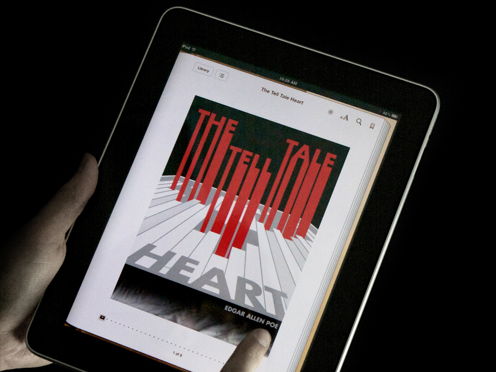
Before the next project progresses any further and I get myself buried again I want to do a quick post on the final images for the Edgar Allen Poe e-Book covers.  The presentation I felt was the best I've given... that may not be saying much in the grand scheme of presentations but I'll take it.  The images that I used for my slides I feel were also nice enough that it made me feel more confident to talk about them.  The main thing that I changed was the typography in The Cask of Amontillado.

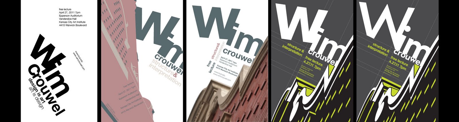
Final Poster for Mister Wim.

Just wanted/needed to put up some kind of final encompassing evolutionary process of my poster for the Wim Crouwel lecture.  This shows the early stage of the typographic exploration, and then applying that to the Vanderslice building in some way.  The real goal was to create something that did not necessarily copy Crouwel's work but utilize the same techniques to create a poster that was appropriate for him.  I used Helvetica as a means to play off the building's edges with its ultra neutral and unifying characteristics.  The color at first was awfully drab and more appropriate to the building than Crouwel's style.  The next stage is when I decided to visibly show the grid work that coincided with the buildings edges and use that grid to hang my type.  The colors I changed to a green, black, and grey combo for an added pop.  The latest iteration that I've done, in order to make the title more fitting to the style of the building, uses a more expressive typeface that contains some of the same elements that I've tried to call out in the building.
I've also cleaned up some of the more arbitrary grid lines and fixed the accidental tracking issues.


One thing that I've learned, other than an the fact that its now difficult to not think of alignment in my compositions, is that even with the use of any strict design system, such as a grid, there is plenty of room to express the desired style of the thing you are designing for.  This is something that Wim Crouwel is the master of.

Monday, April 18, 2011

Peripadicalls

Wired-

Out of the three examples, Wired for the ipad has some of the most attractive examples of the new tablet magazine format and the consequent inovations. They've really taken the user experience into consideration. The user can take part in an enveloping experience which can take place in many individual elements, and can go on for several layers of interaction.  This is not only a breakthrough for the magazine articles and overall story, but also for the advertisements. My favorite example of this is the ad where the interface allows for a 360 look around of a car.

Esquire-

The Esquire magazine's ipad format is as equally layered and intuitive, but I find the Wired layouts more attractive as is usual. They seem to have more first level interaction, but allot of it. It also has the option to scroll through pages with a table of contents that lets you see thumbnails of the full pages.  The Wired version also gives you the option to simply scroll without the thumbnails.  It seems to me as though the layouts share a closer aesthetic to a standard handheld paper magazine.

Time-

The time magazine has something that somewhat stands out from the others, in that it has assigned different functions to the vertical and horizontal format of the ipad. It also has a standard magazine feel to it with the exception of some video and picture interaction. When put in a horizontal position the layouts often become more visual than text based.

Thursday, April 14, 2011

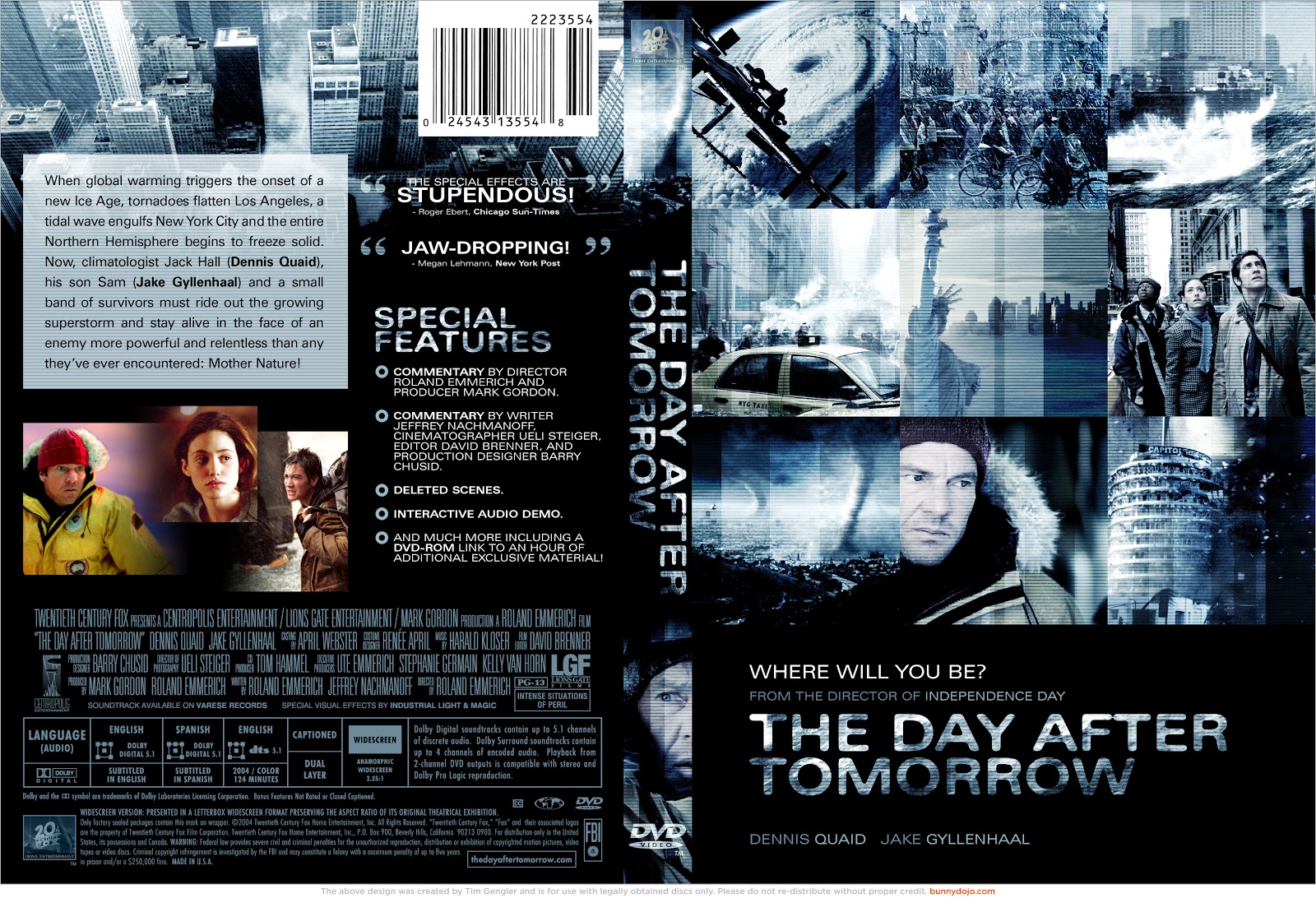
The Day After Tomorrow... Is Saturday.

The day after tomorrow is technically an environmentalist movie, if I remember correctly.


Monday, April 11, 2011

Branding Concept Titles

Here are the titles for the three possible museum exhibitions. (descriptions included)


Perfected Practice-
A look into the time honored traditions of the true sushi masters.


Sushi Under Construction
Discovering the genesis of this ever popular cuisine.


Conform Consume
Considering the assimilation and modification of Japanese culture and cuisine in America.