Wednesday, September 28, 2011

Pushing Products

Luden's Drops (Pathos)
I felt that the packaging for the cough drops, with its lemon and honey and simple description, was very soothing. The way it is illustrated also enforces that. The consumer does have to flip the package around in order to get to more of the factual information. The sides only repeat the main label and on of the sides even has nothing on it. The tag line "Uniquely Good" on its old-timey banner gives it an air of natural authenticity amongst others. The audience should obviously be anyone who has a sore throat in need of soothing.

Audit: Remembered the honey drop and the fact that it was menthol. Pointed out the red stripe and didn't like the the plastic, wanting to get past the plastic to be able to feel the paper. Oral anesthetic was recalled before the tag "soothes everyday throat irritation".


Lidia's Marinara (Ethos)
I chose Lidia's simply because Lidia Bastianich is a renowned Italian chef and food critique, and a staple for great Italian food. The packaging seems to have a simple and seemingly authentic Italian feel to it with its repeating gold frame on a red background. You associate the message of "All Natural, Made With Fresh Ingredients" with the fact that this product is produced and backed with the approval of Lidia herself. The packaging, upon turning the jar, yields more information on who Lidia is and the breakdown of just how natural it is.

Audit: Did not like the way that Lydia was portrayed/printed. Felt she looked possessed or devil like. The contrast between her and the background was disturbing. The rectangle geometric shapes felt like going down a staircase. Visually the sound of the sauce moving could be heard. The name didn't strike him as Italian. Red.


Famous Blaster Small Engine Tune Up (Logos)
This thing is just screaming at you, and in more ways than one. The packaging is bright yellow and does catch your eye on the shelf with all of its descriptions, but in more of a "what the **** was that" sort of way. Its actually quite a battle in trying to figure out just what it is due to the fact that there is plenty of hierarchy but none that's actually helpful. Regardless of this the packaging is completely informational, and some of it is redundantly so.

Audit: Found reading the text in different voices and tones came naturally. Very confusing and excessive. Infomercial like. Liked the color. Text on the side was redundant. How it tells you how to use it but not where to point it was funny.


Monday, September 26, 2011

Grace Kelly (finess finess finish)

So for Grace Kelly I have ended up going with the antithetical representation of her by, showing her symbol interacting with a wintery scene and warming away the snow. Her symbol, the saxophone, is standing in for her warm/sultry tone that she achieves with both her sax and her voice. At the same time I wanted to elude to her youth and also appeal to a younger audience. This is what led me to make the smooth, flowing, playful, and graphic stylistic vector composition that I did. The way in which the type moves freely, echos the movement in the snow drifts, and this movement also leads the eye around to the saxophone. From there the snow drifts movement leads the eye down to the Folly Theater logo and other important information that resides in the banner. I believe I have successfully represented the Grace Kelly Quintet in a way that stays conceptually grounded in both my perception of her and the founding rhetorical tropes. Visually I believe the poster would be appropriate for a younger audience, but would not offend the older regulars of the theater. I also think that the pop of orange/yellow will grab your attention from the street and the rest of the color palette will be appropriate for the season.

This is my earliest success out of the earlier/later iterations. My biggest problem has been getting the color of the grass and the type correct. The type here is beginning to do what I want it to with the exception of the "featuring Phil Woods" line. The color of the grass is still clashing heavily with the color of the sax, but the sax has been more appropriately simplified from the one I had used before. The grass now also suffers from being too detailed. I begin to see the grinch hand problem stemming from that detail.

Here is the poster that I went with to show the people from the Folly Theater. Everything seems in order except fot the green in the grass is now not green enough, but...


I quickly solve that by warming up the green, while not making it too vibrant against the orange of the sax.

Here are the iterations for possible billboards, based off of the same poster.


Here is the final iteration for the billboard format.


Sunday, September 18, 2011

A White Hunter is Nearly a Narrative.

Here are my typographical, temporal solutions to two selections from Gertrude Stein's Tender Buttons. The base concept for my compositions is that I am trying to draw out imagery through typographic  hierarchy. These animated narratives are derived from that idea that with the fragmented nature of the poems still intact, the mind can still make order out of the chaos with only minimal direction. With the white hunter being nearly crazy at the end of my collection, and the way in which the members of that collection interact through the pages of my book I decided to have one video affect the other. The first video foreshadows the other, in the way the text begins to overlap, while the second video deals with the overlaying of text after of a whole collection of text/imagery before it.


Monday, September 12, 2011

Folly

This project is the third annual junior designing of the Folly Jazz Series posters. My artist for which I am deigning is the Grace Kelly Quintet, and also a special guest artist Phil Woods. The concept must be driven by a rhetorical trope (in my case it is antithesis), and it must appeal to a broad range of ages. The antithesis is describing her sound as a thing that is warm, effecting a cold environment. The direction I chose is that of a saxophone, which is indexical of her playing, that is warming a cold snowy area, producing green/spring grass around it. The image will either be photo manipulation, vector, or a mix of the two. This direction is likely more original than my other concepts which, while nice, have been done before. I would like to keep the style youthful and fresh since Grace Kelly is very young for her playing ability. I'm not worried about Phil Woods being misrepresented as anyone of an older caliber of musician would appreciate being associated with a younger crowd.


The metaphorical representation of her warm sultry sound feels dated and is not as original as my antithetical representation.


This last one will be the one I pursue further.


Folly Crit Checklist
Have you connected with the audience?
Yes, but it connects to two different audiences. (young adults/adults)

Is the message clear?
There are moments where the stylistic choices get in the way of clarity. (smooth flowing graphics are better)

Is it visible from a distance?
The darker compositions have more clarity from a distance, while the snowy compositions are muddy.


What is the visual entry point?
The grass is the entry point in the snow compositions. The red sax and the body form are the entry points of the two smokey compositions.


What is the second element you want to see?
Sax in the snow and in the darker compositions.


Do the visual codes connect to and represent the subject?
Conceptually they do. Still working on the formal side of it.

Are there any emotional cues?
The warming in the cold environment gives a warm feeling.

What makes it memorable?
The contrast in color. Original concept.

Are there any distractions?
The banner could be distracting.

Sunday, September 11, 2011

Grace Kelly (sketchy)

These are a round of digital (which regrettably would have been more appropriate at this time, had they been done in pencil) sketches  for possible compositions. These are based off of the three main directions from the concept matrix.


Thursday, September 8, 2011

Grace Kelly (in the matrix)

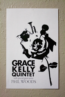
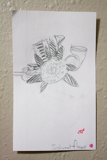
In the genesis of this project the goal was to generate concepts based on our artist (in my case Grace Kelly Quintet) in the light of ten rhetorical tropes. To do this we constructed a matrix that would correlate each of our artist's indexes or symbols with each of these tropes. The three objects that I narrow it down to are the mic/saxophone, smoke, and the flower. The mic/sax is her symbol, the smoke relates to her sultry tone, and the flower relates to her youth/romantic feel.

more or less  synecdoche

metaphor

antithesis

Also a group of possible rendering methods