So I just realized I had not posted the link to the video of my Typographical Design Campaign.
I'm not sure how though as it was my favorite part of the project. I'm really happy with how it turned out and will probably upload it to some other sites to strengthen my portfolio.
http://vimeo.com/20745131

Monday, March 28, 2011
Monday, March 21, 2011
Five Favorite Compositions
These are some of the compositions that for one reason or another I find intriguing. On a few of the compositions during this round I kept Vanderslice Hall in mind, but this proved to be only slightly useful when it came to integration.


Friday, March 11, 2011

Thursday, March 10, 2011
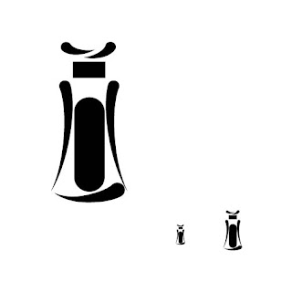
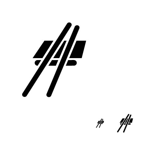
Icons Icons Icons.
Relation to culture-
My icons have a link to my culture in respect to the semi-woodblock print aesthetic. This looks to the traditional Japanese culture. At the same time they have a clean and friendly form and color gives it a more modern look. This could represent the modern sushi restaurant culture which is more adaptive and westernized.
Cohesion-
The icons all follow a strict rule set that keeps them cohesive in form and hopefully function in the future contextual instances.
Legibility-
The legibility of my icons is as good as is possible with my extremely strict rule set. A great deal of their legibility will be reliant on how I utilize them in proper context. This goes especially for the sushi icon (the bane of my existence). Otherwise termed the space amphitheater, this icon may need special attention in the future.
Process-
The process of designing these icons really began with the form exploration utilizing blunt mark making tools. The geometric style of icon gave me a particularly unique form and later yielded a decent set of icons. The rule set includes at least one rectangle, pill shape, and curved tear drop shape. This rule had to be broke slightly later as it slowly broke me. Even with the slightly less strict measures it allowed for a cohesive set. Later when experimenting with the colorization and expanding around the boarders I found the second variation on the final icon set which is more stable and might be applied to differing situations more effectively.


Wednesday, March 9, 2011
Funspiration.
A friend of mine sent me this video he found in which I can point out several interesting design process tidbits. Mind mapping, animated type and image, infographics, comedy, good pacing and music.
http://www.youtube.com/watch?v=t_8Oqxk-wEo&feature=player_embedded
http://www.youtube.com/watch?v=t_8Oqxk-wEo&feature=player_embedded
Friday, March 4, 2011
Digital Final.
Here is my final set of digital icons for seven of my sushi artifacts. This is a tentative set as I will be still looking for things to edit.


Subscribe to:
Posts (Atom)